The physical menu is the most powerful silent salesperson in your modern salon. When a client sits in your waiting area and holds a beautifully unique menu they are not just looking at prices. They are experiencing your brand through their fingertips. In Bangladesh the beauty industry is growing very fast and many new parlors and salons are opening every year. Because of this strong competition, every salon needs to present its services in a smart and attractive way.
One simple but powerful way to do this is through a well planned Menu Design. A clear and beautiful parlor menu helps clients understand services easily and makes them more interested in booking treatments. Plain laminated sheets to intentional Menu Design can be the difference between a basic service and a full premium package. High quality physical menus build trust and authority. If your menu feels premium your services feel premium. Here are 12 modern parlor and salon menu design ideas focusing on physical materials and human psychology to help you drive more bookings.
1 The Heavyweight Linen Texture and Tactile Authority
Touch is the first sense engaged when a client picks up a menu. Using heavyweight linen cardstock provides a cross hatch texture that feels organic and high end. This material is perfect for a Parlor Menu Design because it resists fingerprints better than glossy paper and gives an immediate impression of luxury.
In a climate like Bangladesh where humidity can affect paper quality choosing a high GSM linen paper ensures the menu stays crisp and professional over hundreds of uses. When a client feels the weight of 300 or 350 GSM paper they subconsciously associate that stability with the stability and skill of your stylists. It creates a sense of permanence.
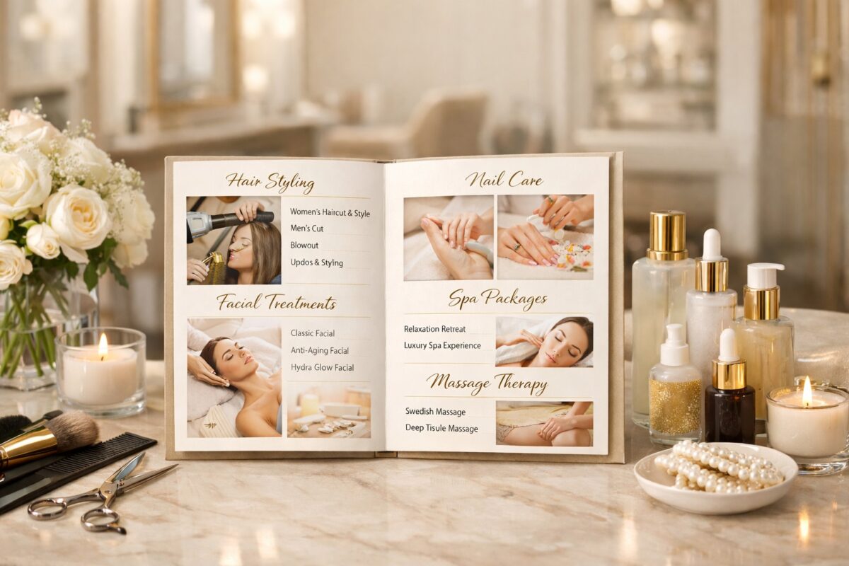
2 The Tri Fold Architecture and Visual Flow
The tri fold layout is a classic for a reason. It allows you to guide the client on a journey through your service list. Use the center panel for your most profitable signature services. This physical layout naturally draws the eyes to the middle first making it the prime real estate for your high margin hair treatments or bridal packages.
A tri fold also provides a natural categorization. You can dedicate the left panel to quick maintenance like threading or waxing the center to high value hair and skin treatments and the right panel to long term packages. This logical flow prevents the client from feeling overwhelmed by too many choices at once.
3 Earthy Tones and Matte Finishes for Visual Comfort
Modern trends for 2026 are moving toward nature inspired colors like sage green terracotta and warm ivory. A matte finish on these colors prevents harsh glare from salon overhead lights. This makes your text easier to read and gives the menu a sophisticated calming vibe that aligns with a relaxation focused spa environment.
Bright neon colors can often trigger a sense of urgency or cheapness. By choosing muted earthy tones you signal to the client that your parlor is a sanctuary. This color palette also complements the natural skin tones often found in South Asian beauty photography which you might include as physical inserts in your menu.
4 Minimalist Typography and the Power of White Space
Expert designers know that clutter creates anxiety. By using clean serif fonts and leaving plenty of empty space around your service names you make the decision process effortless. When a menu is easy to scan clients are more likely to notice add on services they might have otherwise skipped.
White space is not wasted space. It is a design tool that highlights your premium offerings. If a page is packed with text the client will look only for the price. If a page has only five items listed with ample space the client will read every single word of the descriptions leading to higher engagement and more bookings.
5 Gold Foil Accents for Premium and Bridal Services
If you offer VIP or luxury treatments highlight them with gold or copper foil stamping. This physical texture catches the light and signals to the client that these specific services are special. It is a subtle way to nudge them toward a higher spend without saying a word.
In the context of Bangladeshi weddings bridal menus design should always feel like an invitation to an event. Using gold foil on the “Bridal Glow” or “Grand Wedding Package” section differentiates these high value items from a standard haircut. It creates a hierarchy of value that the eye cannot ignore.
6 Bound Leather Folders and Professional Longevity
For high end salons in cities like Dhaka or Chittagong a bound leather or high quality vegan leather folder suggests permanence and elite status. Placing individual printed pages inside these folders allows you to update prices or services easily while keeping the expensive outer shell that clients love to hold.
The leather folder also protects the inner pages from the oils and chemicals often found in a salon environment. This ensures that every single client receives a menu that looks and smells brand new. The weight of a folder adds a level of ceremony to the booking process making the client feel like they are making an important investment in themselves.
7 The Signature Service Box and Visual Anchoring
Draw a physical border around your most popular bundle. Use a slightly different paper color or a thicker line weight for this section. Humans are naturally drawn to items that look featured and a boxed section acts as a visual recommendation from the expert.
You can name this section something like The Expert Choice or Our Most Loved Rituals. By physically separating these items from the rest of the list you reduce the paradox of choice. Most clients are looking for guidance and a well designed box provides exactly that.
8 Hand Drawn Floral Illustrations for Personal Connection
Adding custom sketches of botanical elements or soft floral patterns gives your menu a human touch. In a world of mass production hand drawn elements on physical paper feel personal and bespoke. This works exceptionally well for parlors that focus on organic or herbal beauty treatments.
These illustrations can be placed in the corners or used as subtle watermarks behind the text. They soften the overall look of the menu and make it feel less like a corporate price list and more like a personalized beauty journal. This emotional connection is a key driver for repeat bookings.
9 Strategic Price Placement and Value Perception
Avoid using long dotted lines that lead the eye directly to the price. Instead place the price right after the service description in the same font weight. This keeps the focus on the value and the experience of the service rather than the cost which subtly encourages more bookings.
When prices are aligned in a vertical column on the right side of the page clients tend to scan for the lowest number. When prices are nested within the text the client reads the benefit of the service first. By the time they see the price they have already envisioned the result in their mind.
10 Translucent Vellum Overlays and Sensory Layers
Using a frosted or translucent vellum sheet as a cover page adds a layer of mystery and elegance. It protects the main menu underneath and creates a multi sensory opening experience. It feels like opening a gift which sets a positive tone for the entire salon visit.
Vellum can also be used to show seasonal specials. You can print your main services on a heavy card and then overlay a vellum sheet with monthly offers or holiday packages. This keeps your menu looking fresh and updated without the need to reprint the entire base menu every month.
11 Wooden Board Backing for Organic Brands
For a rustic or eco friendly salon clipping your menu pages to a finished wooden board provides a sturdy tactile feel. It communicates a brand that is grounded and natural. The weight of the wood makes the menu feel substantial and important.
Wooden boards are especially effective in barbershops or unisex salons where a more rugged or industrial aesthetic is desired. Using a high quality wood like teak or mahogany treated with a matte sealer provides a beautiful backdrop for simple white or cream paper menus.
12 Narrative Service Descriptions and Emotional Marketing
Instead of just listing Facial use descriptive language that paints a picture. Words like glow refresh and revitalize engage the imagination. When a client can visualize the result of a service through your words on the page they are much more likely to book it.
A narrative description should describe the feeling of the service. For example instead of Hair Wash you could write A Deep Cleansing Scalp Massage with Botanical Extracts to Restore Natural Shine. The latter sounds like an experience worth paying more for while the former sounds like a chore.
The Importance of Paper Stock in Bangladesh
In the local market the quality of paper is often overlooked. To stand out you must consider the environmental factors. High humidity means that thin paper will curl and feel limp within days. To maintain a professional image always opt for paper that has been treated for moisture resistance or use a high quality lamination that is matte rather than glossy. Glossy lamination often reflects the bright LED lights of a salon making the text impossible to read at certain angles.
Color Psychology in Salon Menus
The colors you choose for your physical menu will dictate the mood of your clients. Blue and green tones are known to lower heart rates and create a sense of calm making them ideal for spa menus. Pinks and purples are traditionally associated with femininity and luxury often used for high end makeup and bridal sections. However modern minimalist salons are leaning toward black and white with high contrast which signals a more clinical and precise level of expertise.
Finalizing Your Menu for Maximum Impact
Before you send your design to the printer read it aloud. Ensure there are no spelling errors as a single typo can ruin the professional image you have worked so hard to build. Check the legibility of your font from a distance of two feet. Your clients will be holding this menu at that distance and if the font is too small or too ornate they will struggle to read it.
A great menu is more than a list. It is a physical representation of your skill and care. By focusing on these tactile and visual elements you create a professional atmosphere that respects the client and elevates your business.