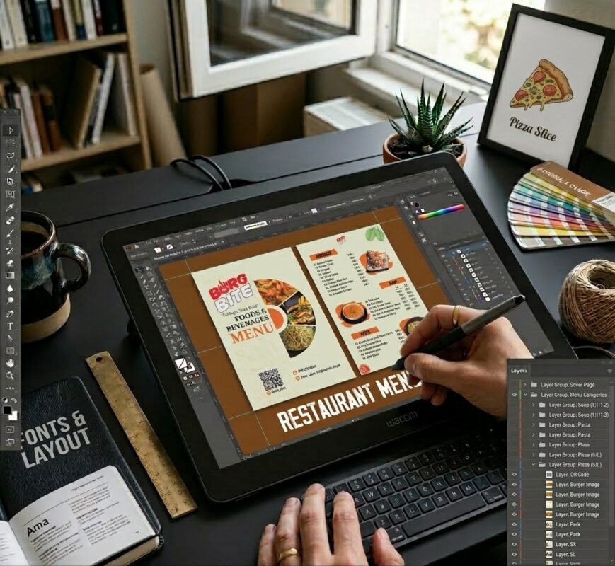
Designing a menu is a lot like plating a signature dish. You can have the highest quality ingredients in the world, but if the presentation is messy, the customer is going to hesitate before taking a bite. In the world of Restaurant Menu Design fonts, your choice of typography is the “plating” of your brand. It’s the silent ambassador that tells your guests whether they are in for a high end culinary experience or a relaxed, greasy-spoon comfort meal long before the server even greets them.
As a graphic designer who has spent years staring at kerning and line heights, I can tell you that fonts aren’t just letters. They are psychological triggers. The right font can actually make food taste better in the mind of the consumer, while the wrong one can make a $50 steak look like a budget cafeteria mystery meat. When i design i am always try to choose best restaurant menu design font with the branding.
Let’s dive deep into the craft of selecting the right typefaces to ensure your menu doesn’t just list food, but sells an experience.
Why Typography is the Backbone of Your Restaurant Menu Design Font
Before we get into the “how,” we need to understand the “why.” Why does it matter if you use a Serif or a Sans Serif?
When a guest opens a menu, their eyes perform a “scan.” Research shows that people spend less than 100 seconds on average looking at a menu. Within that tiny window, your font choice has to do three things:
- Establish Brand Identity: Is this place rustic, modern, elegant, or quirky?
- Ensure Legibility: Can a grandmother read this in a dimly lit bistro?
- Drive Profitability: Can you guide the eye toward high-margin items using visual weight?
If your restaurant menu design font is too decorative, you create friction. Friction leads to frustration, and frustrated guests usually just order the first thing they recognize rather than exploring your more profitable specialties.
The Four Pillars of Menu Typography
In professional Restaurant Menu Design fonts, we generally categorize fonts into four main groups. Understanding the personality of each is your first step toward a cohesive design.
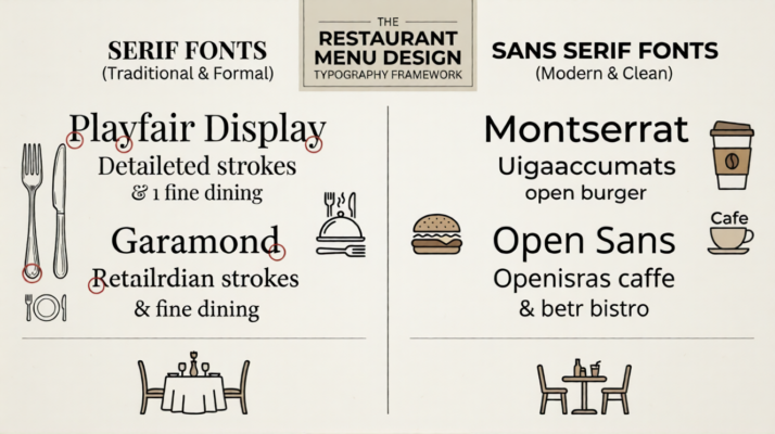
- Serif Fonts: The Traditionalists
Serifs are the little “feet” at the ends of letter strokes. Think of classics like Times New Roman, Baskerville, or Georgia.
- The Vibe: Classic, trustworthy, sophisticated, and formal.
- Best For: Fine dining, Italian trattorias, French bistros, and upscale steakhouses.
- Pro Tip: Use serifs for body text (item descriptions) because the “feet” help the eye move smoothly along a line of text, making it easier to read long descriptions.
- Sans Serif Fonts: The Modernists
“Sans” means without, so these are fonts without the little feet. Think Helvetica, Montserrat, or Futura.
- The Vibe: Clean, approachable, efficient, and contemporary.
- Best For: Cafes, burger joints, sushi bars, and “farm-to-table” spots that want a minimalist look.
- Pro Tip: Sans serifs are incredibly legible at small sizes, making them great for price lists or secondary information.
- Script and Hand-Lettered: The Personality
These fonts look like handwriting or calligraphy.
- The Vibe: Elegant, personal, artisan, or whimsical.
- Best For: Wine lists, dessert menus, or headers for a “daily specials” board.
- Warning: Use these sparingly. A whole menu in script is a nightmare to read. Use them like a garnish—just a little bit goes a long way.
- Slab Serifs: The Bold Statement
These have thick, block-like serifs. Think Courier or Rockwell.
- The Vibe: Masculine, sturdy, vintage, and impactful.
- Best For: BBQ pits, craft breweries, and industrial-style gastropubs.
Choose The Right Restaurant Menu Design Font Category Wise
- The Food Cafe
Cafes are usually about community, comfort, and fresh ingredients. The design should feel approachable and “human.”
- The Vibe: Friendly, casual, and warm.
- The Font Choice: I recommend a Rounded Sans Serif (like Quicksand or Comfortaa) paired with a Handwritten Script for the headers.
- Why it Works: Rounded edges on letters feel softer and more inviting. It tells the customer, “Sit down, grab a coffee, and stay a while.”
- SEO Tip: For a cafe, keep the Restaurant Menu Design font clean with plenty of white space to mimic a “breath of fresh air” feeling.
- The Diner (Casual Dining)
Diners are high-energy and nostalgic. People go there for big portions and classic comfort food.
- The Vibe: Retro, energetic, and bold.
- The Font Choice: Go for a Slab Serif (like Rockwell or Arvo) or a Retro Script (like Pacifico).
- Why it Works: Slab serifs feel “heavy” and “filling,” just like the food. They have a vintage Americana feel that screams “best pancakes in town.”
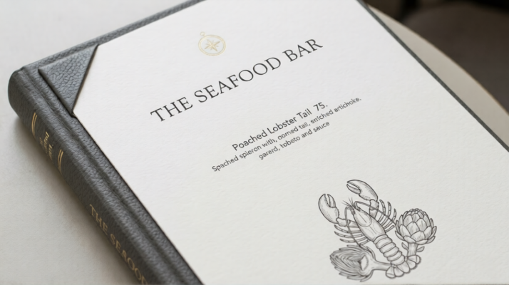
- Luxury Restaurant
In luxury, the menu should feel expensive before the guest even sees the prices. This is where “quiet elegance” wins.
- The Vibe: Sophisticated, exclusive, and minimal.
- The Font Choice: A high-contrast Classic Serif (like Didot, Bodoni, or Playfair Display).
- Why it Works: These fonts have very thin lines contrasted with thick lines. It looks like a fashion magazine. Pair it with a very small, widely spaced Sans Serif for descriptions to create a sense of “prestige.”
- Juice Bar & Healthy Eats
Juice bars are all about health, energy, and “cleansing.” The typography needs to look “thin” and “clean.”
- The Vibe: Vibrant, modern, and organic.
- The Font Choice: A Geometric Sans Serif (like Futura or Montserrat) or a Thin Linear Font.
- Why it Works: Thick, chunky fonts feel “heavy,” which is the opposite of what a juice drinker wants. Thin, airy fonts feel light and low-calorie. Use bright colors like leaf green or citrus orange for the headers.
- The Bar & Pub
Bars are often dimly lit, so legibility is your number one priority here. You also want a look that feels “sturdy.”
- The Vibe: Moody, masculine, and craft-oriented.
- The Font Choice: A Vintage Industrial Serif or a Condensed Sans Serif (like Bebas Neue).
- Why it Works: Condensed fonts allow you to fit long lists of craft beers or cocktails into narrow columns without looking cluttered. They feel “urban” and “cool.”
- Rooftop Restaurant
Rooftop spots are about the view and the “vibe.” The design should feel “elevated” and trendy.
- The Vibe: Chic, breezy, and upscale-social.
- The Font Choice: A Modern Serif paired with an Art Deco style header.
- Why it Works: Art Deco fonts (like Market Sans or Brandon Grotesque) remind people of the golden age of skyscrapers and city lights. It feels “top-shelf.”
Comparison Table for Quick Reference
| Restaurant Type | Primary Header Font | Body Text Style | Mood Conveyed |
| Food Cafe | Friendly Script | Rounded Sans Serif | Approachable & Warm |
| Diner | Bold Slab Serif | Classic Sans Serif | Nostalgic & Filling |
| Luxury | High-Contrast Serif | Minimalist Light Serif | Exclusive & Elegant |
| Juice Bar | Clean Geometric | Ultra-Light Sans Serif | Fresh & Healthy |
| Bar / Pub | Bold Condensed | Sturdy Mono-spaced | Urban & Craft |
| Rooftop | Art Deco / Trendy | Modern Serif | Chic & Social |
Pro Designer Tips for All Concepts
Regardless of the niche, keep these “Human-First” rules in mind for your Restaurant Menu Design font:
- Don’t Just Use “Default” Fonts: Avoid Arial, Calibri, or Times New Roman. They look like a word document, not a professional menu. It makes the restaurant look “lazy.”
- Think About the Lighting: If you are designing for a Bar or a Rooftop at night, use a larger font size. If the guest has to use their phone flashlight to read your menu, you’ve already lost the “luxury” feel.
- Color Matters: Darker backgrounds with light text (Reverse Type) look great for bars, but they are harder to read. For cafes and juice bars, stick to dark text on light backgrounds for a “clean” look.
- Consistency is King: If your logo is a certain font, try to find a menu font that “complements” it, but doesn’t exactly match it. You want contrast, not a mirror image.
Choosing the right restaurant design menu font is about knowing who your customer is and how you want them to feel when they sit down. When you get the typography right, the menu stops being a list and starts being a marketing tool that drives sales.
The Psychology of Font Weight and Spacing
Choosing the font is only half the battle. How you “set” the type determines the flow of the menu.
Hierarchy is Your Best Friend
In Restaurant Menu Design fonts, hierarchy is the order in which a guest reads the information. Usually, it goes: Category Heading -> Dish Name -> Description -> Price.
You create hierarchy by varying the “weight” of the font. Use a Bold or Semi-Bold for the dish name to make it pop. Use a Regular or Light weight for the description so it feels secondary. If everything is bold, nothing is bold. You want the eye to jump from dish to dish easily.
The Mystery of the Price
Here is a secret from the design world: avoid using currency symbols like dollar signs. They remind people they are spending money. When it comes to the font for prices, keep it simple. Don’t make the price bigger than the dish name. In fact, many high-end designers suggest using the same font weight as the description for the price, so it blends in rather than standing out as a “barrier” to the sale.
Give it Room to Breathe (Leading and Kerning)
Leading is the space between lines of text. In a dark restaurant environment, tight text is hard to read. Increase your leading slightly so that the descriptions don’t look like a wall of gray. White space is not “wasted” space; it’s “luxury” space. It tells the guest that your food is curated and important.
Matching the Restaurant Menu Design Font to the Concept
Your font choice must be an extension of your interior design. If your restaurant has exposed brick, Edison bulbs, and reclaimed wood, a sterile, futuristic font like “Orbitron” will feel jarringly out of place.
The Fine Dining Approach
For high-end establishments, less is more. You might choose a very thin, elegant Serif for headings and a tiny, clean Sans Serif for descriptions. The goal here is “quiet luxury.” You want the guest to feel like the food is the star, and the menu is just an elegant program for the performance.
The Fast-Casual Approach
For a place where speed and volume matter, you want bold, high-contrast Sans Serif fonts. Use fonts that are easy to read from a distance or on a backlit board. Bright colors paired with thick typography suggest energy and affordability.
The Artisanal/Bakery Approach
Here, you can lean into hand-drawn fonts. A “chalkboard” style font can make a guest feel like the food was prepared fresh this morning just for them. It adds a human touch that feels authentic and local.
Common Mistakes to Avoid in Restaurant Menu Design font
Even seasoned designers fall into these traps. If you want a professional result, steer clear of these pitfalls:
- The “All Caps” Trap: Writing descriptions in ALL CAPS is the typographic equivalent of screaming at your guests. It is also significantly harder to read because all the words have the same rectangular shape. Save all caps for short headers only.
- Over-Decoration: Don’t use more than three different font families on a single menu. Usually, two is the sweet spot: one for headers and one for everything else. Any more than that and your menu starts to look like a ransom note.
- Low Contrast: Light gray text on a cream background might look “chic” on a computer screen, but in a dimly lit dining room, it’s invisible. Ensure there is enough contrast between the text and the paper.
- Ignoring the Fold: If you have a multi-page menu, make sure the fonts remain consistent across every page. The “Specials” shouldn’t look like they belong to a different restaurant.
The Technical Side: Legibility Testing
Before you hit “print” on a thousand copies, you need to do a real-world test. Print a sample at the actual size and take it into your restaurant during the busiest, dimmest shift.
- Can you read it at arm’s length?
- Does the font “break up” or get blurry if the paper gets a little greasy or wet?
- If you have an older demographic, is the font size at least 10pt or 12pt?
These practicalities often trump “artistic” choices. A beautiful menu that nobody can read is a failure.
How to Pair Like a Pro For Restaurant Menu Design Font
If you’re feeling bold and want to mix two fonts, follow the rule of opposites.
- Pair a Decorative Header with a Simple Body: If you have a beautiful, flowery script for the “Appetizers” heading, pair it with a very plain, clean Sans Serif for the actual dishes.
- Pair a Bold Slab Serif with a Light Serif: This creates a rugged, “newspaper” style look that works great for gastropubs or breakfast spots.
The goal of pairing is contrast. You want the two fonts to look distinct enough that it’s clear they were chosen on purpose, rather than looking like you accidentally used two fonts that are “almost” the same.
Final Thoughts from the Designer’s Desk
At the end of the day, Restaurant Menu Design font is about storytelling. Your font is the voice of that story. Whether you want to whisper elegance or shout “best burgers in town,” your typography is the tool that gets you there. Think about your favorite restaurant. Think about how the menu felt in your hand. Chances are, the typography played a huge role in your comfort level and your excitement for the meal, even if you didn’t realize it at the time. Invest the time to find a typeface that resonates with your brand’s soul.
Don’t just settle for what’s pre-installed on your computer. Look for something unique, something legible, and something that makes people hungry just by looking at it.
Design is often what separates a “one-time visit” from a “neighborhood favorite.” Make sure your menu invites people to stay, read, and most importantly eat.